
10 Truly Terrifying Branding Mistakes to Avoid for Your Business

By Natasha Gayle | SEO Specialist, BGD Digital Marketing
October 11, 2022
Estimated Reading Time: 4 minutes
Rather than tell a scary ghost story for October, we thought it would be appropriate to share some terrifying branding mistakes companies have made for their businesses.
These spooky tales won’t terrify you like a ghost story might, but they offer us a similar lesson. Just like a ghost story teaches us not to enter a spooky, haunted house in the middle of the woods, these bad branding examples should encourage you to avoid the same fatal mistakes when building your company’s brand.
10 Terrible Branding Mistakes to Avoid
1. Bad Abbreviations for Brand Names

Think about the name of your company and how it will be shortened.
If your company name, when abbreviated, stands for something else, it may distract users from who you truly are and what your brand has to offer.
While Mental Floss is a great brand name, the abbreviation is a little distracting, especially since they used it for their profile image… Whoops!
2. Duplicate Company Names


Don’t duplicate the name of another company.
Consider Delta. Which Delta do you mean? Delta Airlines, Delta Faucets, Delta Dental? Fortunately, these companies have done pretty well for themselves despite having duplicate names, but if you are a new company, conscious of your budget, you are going to make marketing and advertising so much harder on yourself - and more expensive, too!
Do some research beforehand when choosing your company name.
3. Not Connecting with Your Audience
There are so many companies who waste their marketing efforts by not understanding who their target audience is and how to connect with them.
Does your product or service resonate with seniors? What about young professionals? New parents? Is Diversity, Equity & Inclusion (DEI) a priority for you? The answers to these questions - and more - should inform your brand messaging and designs and how to connect with your audience.
An example of not understanding your audience and how to connect with them can be seen in this Pepsi commercial.
Instead of connecting with their audience, Pepsi created a commercial that was extremely insensitive and emotionally charged.
Had they had a DEI consultant on staff proofing their writing, they could have avoided some painful backlash from their ad.
4. Poor Logo Design

Consider the way your logo looks when you’re designing it. A truly terrifying example we found was by the National Cowgirl Museum Hall of Fame. While we believe the intent of the logo was to create a Western boot spur, it resembles something else entirely… Anyone else see what we’re talking about?
Make sure the look of your logo is professional and doesn’t cause your users to squirm in discomfort or laugh uncontrollably when they visit your website.
5. Unprofessional Fonts

Another terrifying branding mistake we see companies do is choose unprofessional fonts for the headings, text, and logo script on their website.
We want you to associate Comic Sans with that spooky, haunted house in the woods. You should steer clear of it!
Using Comic Sans in a professional setting is not the way to go, neither is using any of these font types for your business.
This goes for brands that are kid-focused, too, which can sometimes seem like an exception but they aren’t. Take one of our clients as an example - Gifted and Aligned. We used fonts that are indicative of a child service without sacrificing professionalism.
Here is a list of the best professional fonts to use for your website if you’re unsure about where to start.
6. Unreadable Logo Script and Texts
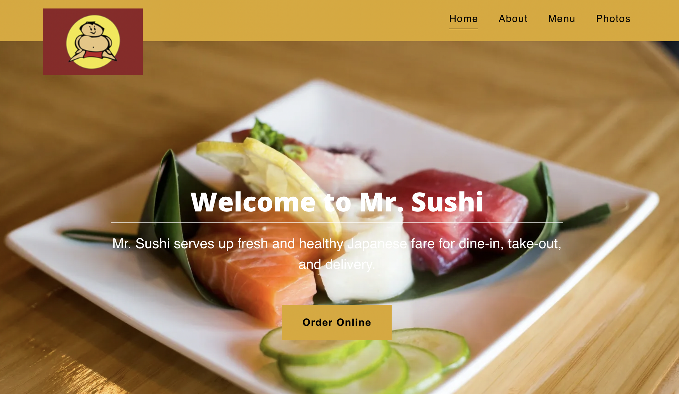
Another bad branding mistake companies make is choosing logo scripts and website texts that are unreadable for their users. You can make this mistake a few different ways.
Some companies love cursive scripts for their brand because they believe it gives it a more elegant and sophisticated look, but if the script is unreadable, it doesn’t come off as sophisticated at all - users don’t know what your company is about!
Not only that, but you also have to be careful about the colors you choose to use for your images and texts so everything is readable.
Take Mr. Sushi, for example - an awesome name for a Sushi restaurant, if you ask me! The font size and type is readable, but it’s very difficult to read white on white.
Additionally, you should pay attention to the size of your logo’s script so it is easy for users to read, especially as you think about your target audience. Is your target audience older? They’ll likely need larger and clearer text.
7. Website Designs from the 90s

I think this speaks for itself. Hopefully your website hasn’t gotten as outdated as this, but it’s an important reminder to keep up with the times.
An old and outdated brand won’t attract or keep many visitors. I’d be too scared to click and get malware, wouldn’t you?
Here are ways Apple and other prominent brands have transformed their websites from the 90s to modern day.
8. Inconsistent Branding Across Platforms
As you use and create images for your brand, they need to be consistent online and off so users quickly and easily recognize you.
When you post on social media, create new Web content, develop brochures and flyers, ask yourself, “Are these materials consistent with my brand messaging and products? Do the colors make sense and match my brand designs?”
Here’s an example of one of our clients with great brand consistency across the Web. Her brand is easily recognizable by her audience no matter where they are - her website, social media, Google, etc.
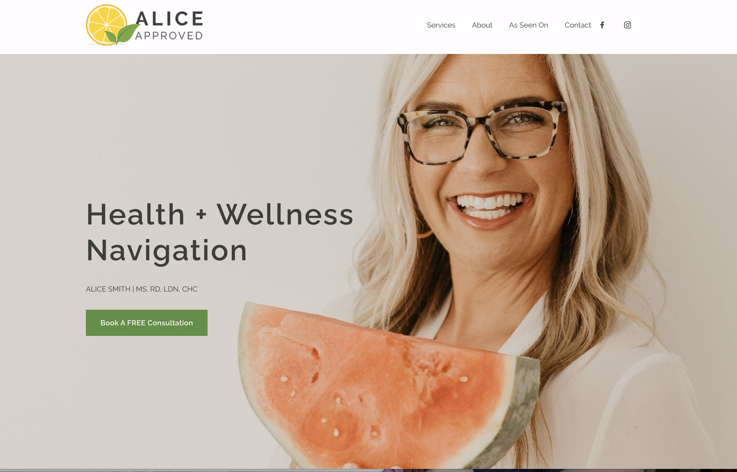


Learn more about the dangers of inconsistent branding and why it’s so important for your business to get it right.
9. Unplanned Social Media Marketing

A major way to be disconnected with your users is to post social content that is irrelevant to them and unrecognizable.
Take this Colgate image for example. I think they’ve left us all scratching our heads. Why would they post a bowl of rice? What does this have to do with toothpaste or my dental health? Brushing your teeth afterward, maybe? Having cilantro-flavored toothpaste? We have no idea.
By effectively planning out your social media strategy and campaigns, you can avoid costly branding mistakes and ensure each and every post is relevant and consistent with your brand, as well as resonates with your followers.
Additionally, think through your brand priorities. What do you want to communicate with your users about your brand? Who are you looking to connect with? Are you focused on DEI? Here are some tips for how to promote DEI initiatives on social media more effectively.
10. Not Proofing Your Content

You’ll lose audiences real quick if you aren’t proofing your content. Not only could you experience some embarrassing mishaps with your marketing messages, but if your content is unreadable and sloppy, your users could miss what you’re trying to say about your product or brand altogether.